A brand’s logo is the visual representation of a company and what it stands for. There are many decisions to make when choosing a logo, and one of the most important factors is color. Colors are associated with many different beliefs and emotions so they impact how people will perceive your company.
Research has shown that people make subconscious decisions about a company or product within the first 90 seconds, and color weighs heavily in this decision. Believe it or not, your logo and associated color palette could make or break a prospect’s decision to become your client.
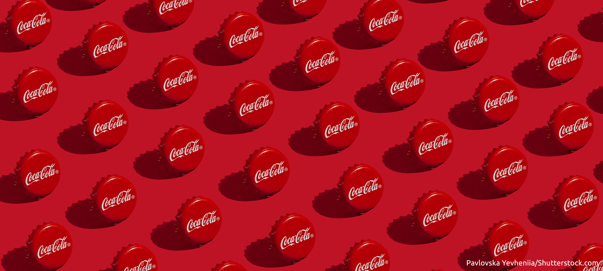
This month, we’re taking a deep dive into the color Red and spotlighting one brand who has truly embraced this bold color—Coca-Cola.
A Colorful History
More than 130 years ago, Coca-Cola was sold in barrels, as was alcohol. But, while alcohol was taxed at the time, soft drinks were not. So, the Coca-Cola Company painted its barrels red in order to help customs and tax officials distinguish them from barrels containing alcohol. As barrels were replaced by bottles, the red color was retained and became an integral element of the product’s identity.
Coca‑Cola inventor Dr. John Pemberton’s bookkeeper and partner, Frank Robinson, came up with the name Coca‑Cola and designed the font of its now historic logo. Robinson liked the contrast of red and white so, he added the tagline “Coca‑Cola Delicious and Refreshing”, using red lettering over a white background on the company’s earliest logos.
Why Choose Red?
There’s no doubt that red evokes emotion. It can be used to signify anger (as in the term, “seeing red”) or love and seduction. A red street sign makes you literally stop in your tracks. A color you can’t ignore, red is often associated with increased excitement and urgency, which is why we see it used in tags and signage for clearance sales.
“There’s an incentive to make logos red because red is the most visible color,” says Bevil Conway, a neuroscientist with the National Eye Institute. He and other researchers have studied how color translates across languages.
Aside from grabbing our attention, the color red has been proven to stimulate appetite. Whether or not you realize it, the color red will make you want to eat. This is why food, beverage and restaurant brands typically use red. It’s especially popular in fast food chains. We dare you to name fast food places that don’t use red – and now that we’ve pointed it out, you can’t “unsee” it.
The Special Shade of Coca-Cola Red
Can you imagine walking into a grocery store and seeing a bottle of “Coca-Cola” in an oddly unfamiliar shade of pinkish or purplish red? You may not grab it because you’re immediately mistrustful. A company protects its identity by standardizing brand elements like colors and fonts. Early on, Coca-Cola embraced an exact tone of red, now known as “Coke Red”. In the Pantone Matching System, it is PMS 484. This signature red is used throughout its signage and merchandise so consumers always know how to spot “the real thing”.
Over the years, the company has repeated the red and white color palette throughout its products, like the classic Coca-Cola, Coke Zero, and Diet Coke. Keeping your branding consistent with the repetition of an exact tone and hue of color helps your customers embrace future iterations of your products and services. Your color becomes part of the trust factor throughout the life of your business.
Color is a powerful tool and it’s important to use it to your brand’s advantage.